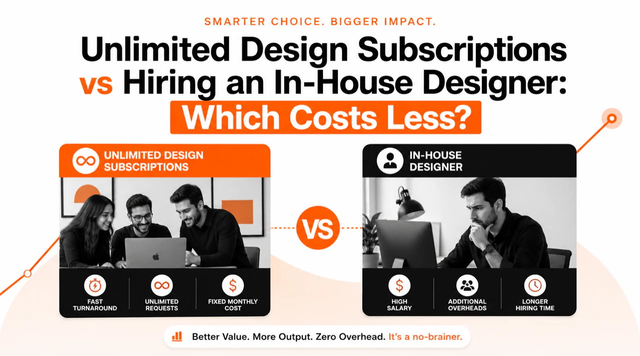
Let’s be honest. When you hear “Google Slides,” the word “cool” isn’t always the first thing that comes to mind. We’ve all sat through presentations built on the same handful of default themes, and the effect is… forgettable. In a world where every touchpoint is a reflection of your brand, a generic presentation can subtly undermine your credibility.
After designing over 150,000 slides for everyone from scrappy startups to Fortune 500s, we know that the right visual foundation does more than just make your slides look good. It makes your message clearer, your brand stronger, and your audience more receptive. This guide cuts through the clutter to show you what truly makes a corporate theme effective and shares 10 concepts that will make your deck stand out.
Quick Answer
Cool Google Slides themes for corporate presentations prioritize clarity, brand alignment, and versatility. With users forming a first impression in under 50 milliseconds (Source: Nielsen Norman Group), a strong visual start is critical. The best themes deliver:
- Clean, professional layouts that avoid clutter.
- Flexible and strategic color palettes.
- Strong, readable typography.
Why Your Google Slides Theme Matters More Than You Think
A presentation theme isn’t just a background; it’s the entire environment where your ideas live. It sets the tone before you even say a word. In business, perception is reality, and a poorly chosen theme can signal a lack of attention to detail. Conversely, a sharp, professional theme builds immediate trust.
Think about the speed of digital judgment. Your audience isn’t just listening; they’re looking. They’re forming opinions about your company’s professionalism and competence based on the visual evidence in front of them.
Time it takes users to form a design opinion
50 ms
Of communication based on nonverbal cues
A cohesive theme acts as a silent partner, reinforcing your brand identity on every slide. It ensures that colors, fonts, and logos are consistent, creating a seamless experience that feels professional and intentional. This visual discipline keeps the focus where it belongs: on your message.
The Anatomy of a “Cool” Corporate Theme
What separates a “cool” theme from a cluttered one? It’s not about flashy animations or trendy colors. It’s about a deliberate design system built on a few key principles.
- Clarity Over Clutter: The best themes use whitespace strategically. A clean layout gives your content room to breathe, making it easier for the audience to digest complex information. Every element should have a purpose; if it doesn’t add to the message, it’s just noise.
- Strategic Use of Color: A professional theme rarely uses more than three or four primary colors. It includes a palette of primary brand colors and secondary accent colors for charts, callouts, and links. The goal is brand consistency, not a rainbow.
- Typography That Works: Legibility is non-negotiable. A great theme pairs a clear, readable body font (like Lato or Open Sans) with a strong, distinct heading font (like Montserrat or Merriweather). The hierarchy should be obvious, guiding the reader’s eye through the content.
- Layout Versatility: A robust theme provides a variety of master slides. You need more than a title and a bullet point slide. Look for layouts designed for data visualization, image showcases, team introductions, and powerful quotes. This versatility saves you from “Frankensteining” slides together later.
Our Top 10 Picks for Google Slides Theme Concepts
Instead of pointing you to a marketplace of disposable templates, we’re sharing 10 professional theme *concepts* we use as inspiration. These archetypes can be adapted to fit almost any corporate brand.
- The “Venture” Theme: Clean, data-forward, and energetic. Features a light background, one bold accent color, and san-serif typography. Its layouts are optimized for charts, KPIs, and financial projections. Perfect for pitch decks and investor updates.
- The “Zurich” Theme: Minimalist, structured, and authoritative. Inspired by Swiss design, it relies on a strong grid system, ample whitespace, and a single, elegant font family. Ideal for financial services, consulting, and any business where precision is paramount.
- The “Marquee” Theme: Bold, high-contrast, and modern. Often uses a dark mode background with vibrant accent colors and oversized heading typography. This theme is designed to make a statement and is excellent for product launches and marketing presentations.
- The “Kyoto” Theme: Organic, calm, and trustworthy. Uses a nature-inspired color palette (earth tones, soft greens) and layouts with plenty of negative space. It suits brands in the wellness, sustainability, or lifestyle sectors.
- The “Cadence” Theme: Geometric, systematic, and technical. This theme uses subtle patterns, icons, and structured containers to organize information. It’s a great fit for SaaS companies, software demos, and explaining complex processes.
- The “Holborn” Theme: Classic, refined, and prestigious. It pairs a timeless serif font for headers with a clean sans-serif for body text. The color palette is understated and traditional. Perfect for law firms, established institutions, and luxury brands.
- The “Kinetic” Theme: Dynamic, image-heavy, and engaging. This theme is built around powerful, full-bleed imagery and creative photo masks. It works best for creative agencies, retail brands, and portfolio presentations where visuals tell the story.
- The “Edison” Theme: Functional, detailed, and innovative. It often incorporates blueprint-style graphics, monospaced fonts for data, and a clean, technical aesthetic. Excellent for engineering, architecture, and manufacturing presentations.
- The “Gallery” Theme: Editorial, clean, and content-focused. Designed like a high-end magazine, it uses strong typographic hierarchy and asymmetric layouts to showcase both text and images beautifully. It’s great for annual reports and case studies.
- The “Momentum” Theme: Bright, optimistic, and forward-thinking. This theme uses soft gradients, modern iconography, and rounded corners to create a friendly and approachable feel. A strong choice for tech companies, HR presentations, and internal communications.
Beyond the Template: Customization is Key
A great theme is just a starting point. The real magic happens when you infuse it with your brand’s unique DNA. Simply dropping your logo onto the first slide isn’t enough. True customization involves adapting the theme’s core elements to align perfectly with your visual identity.
This means updating the master slides with your specific brand colors, loading your corporate fonts, and creating custom layouts for the types of content you present most often. Do you show a lot of user testimonials? Create a master slide for it. Do you constantly present project timelines? Build a layout for that.
For teams that need a reliable and professional starting point, our designers have crafted a collection of business-ready slides. You can explore them at PitchWorx Templates. But when the stakes are high and you need a presentation that is truly bespoke, off-the-shelf solutions fall short. That’s when a custom-designed presentation becomes an investment, not an expense. Our team specializes in transforming ideas into powerful visual narratives. We go beyond templates to build decks that win deals, secure funding, and inspire action. Find out more about our presentation design service.
Frequently Asked Questions
1. Can I use a free Google Slides theme for a professional presentation?
You can, but proceed with caution. Many free themes are poorly constructed, with inconsistent layouts and limited flexibility. If you use one, ensure it has a wide variety of master slides and that its color and font schemes are easy to customize for your brand.
2. How do I change the color palette of a Google Slides theme?
Go to “View” > “Theme builder.” Click on “Colors” in the top toolbar. From there, you can customize the primary and accent colors for the entire theme, ensuring every new slide or shape automatically aligns with your brand palette.
3. What’s the difference between a theme and a template?
A theme is the foundational design system—it defines the colors, fonts, and basic layouts (master slides). A template is a pre-built presentation file that uses a specific theme and comes with a set of pre-designed content slides for you to fill in.
4. Are animated themes good for corporate use?
Less is more. Subtle, professional animations (like a soft fade-in) can help pace your presentation. However, distracting or cheesy animations (like spins or bounces) can make your presentation look amateurish and detract from your message. Use them sparingly and with purpose.
5. How can I ensure my theme is accessible?
This is crucial. Use high-contrast colors (e.g., don’t put light gray text on a white background). Use large, readable fonts. Add alt-text to all meaningful images for screen readers. Google provides excellent resources for making your work more accessible. You can learn more on the Google Workspace Learning Center.
Your presentation is often the first and most lasting impression you make. Choosing a theme that reflects the quality of your work is one of the easiest ways to build credibility. Don’t settle for the default. Your ideas deserve a better stage.