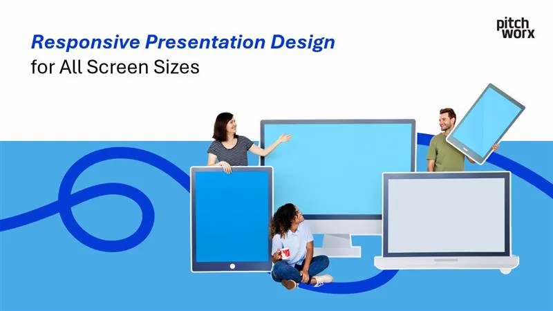
Creating presentations that captivate and inform your audience is no small feat. But in today’s world, where presentations are viewed on everything from laptops to smartphones and 4K projectors, responsive presentation design is no longer optional—it’s essential.
This post will guide you through the importance of responsive design, what it entails, tools to use, and actionable tips for creating presentations that look flawless on any screen size.
Why Responsive Design is Crucial for Presentations
The demand for dynamic, adaptable content has surged as audiences increasingly consume information across a variety of devices and screen sizes. Imagine presenting a beautifully designed slide on a smartphone, only for your carefully crafted text to overflow the edges. Or, on a large screen, your slide looks stretched, breaking its aesthetic appeal.
Responsive presentation design solves these challenges, ensuring that your slides maintain clarity and visual appeal no matter where they’re displayed.
Key benefits include:
- Consistency: Maintain your brand’s professionalism and credibility across all platforms.
- Improved Engagement: Well-structured visuals hold your audience’s attention better.
- Versatility: Your presentation becomes shareable and functional in any context, from virtual meetings to live events.
Understanding Screen Sizes
Before you can create a responsive presentation, it’s essential to understand the different screen sizes you may need to accommodate.
Common Resolutions and Ratios
- 16:9 (Widescreen): The most common aspect ratio for presentations today, ideal for laptops, projectors, and TVs.
- 4:3 (Standard): Popular for older monitors and projectors, still used in many educational institutions.
- 1:1 (Square): Often used for social media presentations.
- Vertical Screens (Mobile Devices): Optimized for users who view slides on smartphones and tablets.
Why It Matters
A one-size-fits-all approach won’t work. Knowing your audience and their device preferences helps you decide how to structure your content and avoid issues like text overflow or pixelated images.
Key Principles of Responsive Design
- 1. Scalable Design Elements: Use vector-based graphics and scalable fonts. This ensures your elements look sharp on high-resolution displays without distortion. Avoid raster images, which can lose quality when scaled.
- 2. Flexible Layouts: Design slides that adapt to various aspect ratios. Use grids and alignment tools to create layouts that stay cohesive when resized. Keep essential elements within a “safe zone” to prevent accidental cropping.
- 3. Optimized Media: Compress and optimize images and videos to ensure fast loading times without sacrificing quality. Tools like TinyPNG, Squoosh, or any built-in image optimizer in design software can help you strike this balance.
- 4. Minimalistic Text: Stick to a minimal amount of text per slide. Overloaded slides don’t just harm readability; they also make adjusting layouts for smaller screens a nightmare. Use large, legible fonts that scale well across devices.
Tools and Techniques for Responsive Presentations
- 1. Presentation Software: PowerPoint: Leverage features like slide master layouts, which provide consistency across slide designs, or the “Design Ideas” feature for inspiration. Google Slides: A great option for real-time collaboration with scalable templates. Canva: For highly visual presentations with built-in tools to resize graphics for different formats.
- PowerPoint: Leverage features like slide master layouts, which provide consistency across slide designs, or the “Design Ideas” feature for inspiration.
- Google Slides: A great option for real-time collaboration with scalable templates.
- Canva: For highly visual presentations with built-in tools to resize graphics for different formats.
- 2. Testing Across Devices: Always preview your presentation on multiple devices. Most software enables you to test layouts in different aspect ratios. For instance: PowerPoint offers an aspect ratio adjustment feature for testing presentations in both 16:9 and 4:3. Use emulators for smartphones or simply test on your own device.
- 3. Responsive Web Embeds: If your presentation will live online, consider embedding it into a responsive website. This allows the presentation to adapt seamlessly to any screen size. Tools like Prezi or SlideShare are excellent for web-based hosting.
Case Studies in Responsive Presentation Design
1. Investor Pitch for a Fintech Client
The Challenge
The client needed a presentation that worked for boardroom projectors and mobile screens for remote stakeholders.
The Solution
Using PowerPoint’s grid-based layout and scalable vector graphics, we designed slides with minimal text and bold visuals. The typography scaled effortlessly, and we included interactive buttons for easy navigation on both laptop and mobile devices.
The Result
The client secured funding and received praise for their professional and adaptable presentation.
2. Marketing Deck for a Social Media Campaign
The Challenge
A social media platform wanted a deck to share analytics and upcoming strategies across their internal teams using different devices.
The Solution
Through Google Slides, we created a sleek design with color-coded icons to represent different metrics. Each slide maintained a 16:9 format but was built with “safe zones” for easy cropping.
The Result
The deck was widely adopted across the company, streamlining communication and improving engagement during presentations.
Best Practices for Responsive Presentation Design
- Make Use of White Space: Less is more! White space makes presentations visually appealing and ensures important content isn’t crowded.
- Stick to a Cohesive Color Palette: Neutral tones with one or two accent colors enhance the professional look and feel of your slides.
- Include Interactive Elements: Add navigation buttons or hyperlinks to improve flow, especially if your audience will interact with the content on their own devices.
- Use High-Quality, Licensed Images: Avoid blurry stock photos or generic visuals. Aim for high-resolution images that align with your message.
The Future of Responsive Presentation Design
The demand for adaptable presentations isn’t going away, especially as remote work and hybrid events become the norm.
Key trends include:
- AI-Powered Design Tools: like Microsoft Designer and Canva are already incorporating intelligent design suggestions.
- 3D and Immersive Presentations: Augmented and virtual reality are set to disrupt how we deliver not just presentations but entire experiences.
- Real-Time Collaboration: Remote teams will increasingly rely on platforms like Miro and Figma to create dynamic, interactive slides in real time.
Take the Next Step
Are you ready to make sure your next presentation looks amazing on every device? At PitchWorx, we specialize in creating responsive, visually compelling presentations tailored to your needs.
- Explore Our Services: Check out our PowerPoint presentation design services.
- Schedule a Consultation: Book a call with one of our specialists to discuss how we can elevate your presentation game.
- See Our Work: Browse our portfolio for examples of successful client projects.
Don’t leave your audience squinting on their screens. Partner with PitchWorx and ensure your next big presentation makes a lasting impact.
FAQs about Responsive Presentation Design
What is responsive presentation design?
Responsive presentation design means creating slides and content that adapt and display correctly on various screen sizes and devices, such as laptops, tablets, smartphones, and large projectors. This ensures consistency, clarity, and optimal viewing experience for all audience members, regardless of their screen.
Why is responsive design important for modern presentations?
With audiences viewing presentations on diverse devices (including mobile), responsive design prevents content from being cut off, distorted, or unreadable. It improves audience engagement, maintains brand professionalism across platforms, and makes your presentation more versatile for various viewing environments like webinars or shared documents.
What are the key principles of creating responsive slides?
Key principles include using scalable design elements (like vector graphics and flexible fonts), designing flexible layouts that adapt to different aspect ratios, optimizing media for fast loading, and keeping text minimal and legible on various screen sizes.
Which presentation software supports responsive design principles?
Software like PowerPoint, Google Slides, and Canva allow you to apply responsive principles. Features like master slides, layout options, alignment tools, and aspect ratio previews help in designing for adaptability. While they don’t automatically make slides responsive like a website, they provide the tools needed for manual optimization across intended formats.
How can I test if my presentation is responsive?
The most effective way is to preview your presentation on the actual devices and screen sizes your audience will likely use. Most presentation software offers preview modes or aspect ratio adjustments (e.g., 16:9 to 4:3). For mobile viewing, try sharing the presentation link (if using platforms like Google Slides or hosted versions) and view it on your smartphone or tablet.