Most founders think the design of their deck is what's holding the round back. After designing 600+ pitch decks, we can tell you: the design is almost never the problem. Three structural decisions, all made before the first slide is touched, decide whether a deck closes or doesn't.
Decision 1: What is this deck actually for?
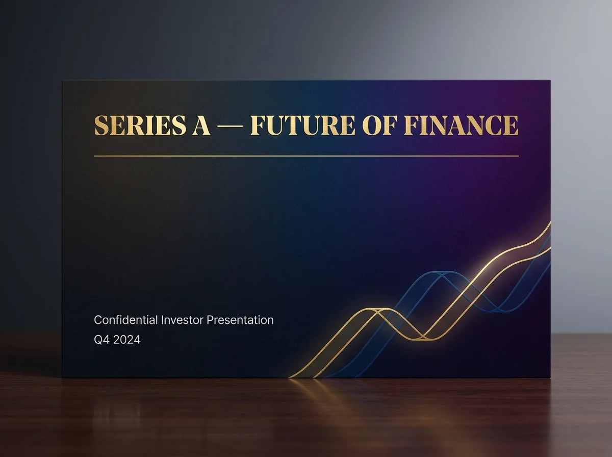
There are three kinds of pitch deck and they should look almost nothing alike. A teaser deck, sent cold to investors who haven't met you yet, needs to do one job: get a meeting. A meeting deck is what you walk through live, with you driving the narrative, the slides supporting. A leave-behind deck is what stays after the call, which the partner reads alone, and which has to make the case without you in the room.
Most failed decks try to be all three. They're too dense for a teaser, too sparse for a leave-behind, too detailed for a meeting. Pick one job before you brief the designer. Write the other two as separate decks if you need them.
A deck trying to do all three jobs at once does none of them. Pick the job, then design the deck.
Decision 2: What's the one number this round is about?
Every round that closes has one number that matters more than the others. ARR, retention, payback period, gross margin, weekly actives, depending on the company and the stage. That number should appear on slide 3, slide 8, and the closing slide. If a partner reads only those three, they should know what this business is and why it's worth funding.
Founders who haven't decided which number this round is about end up with decks that show every number. Investors read those decks as 'they don't know what's working.' We've watched this kill rounds that should have closed.
Decision 3: What's the one slide the partner shows their team?
After the partner meeting, the deal goes to a partner meeting at the firm. The partner you met has 90 seconds to convince the room. They will show one slide. Sometimes two. Decide which slide that is, before slide 1 is designed. Make it self-contained. Make it look right printed at A4. Don't bury it on slide 12.
What good design actually adds
- Pacing, visual rhythm that holds attention across 14 slides.
- Confidence signals, the deck looks like it was made by a company that's already winning.
- Information density that respects reading speed, neither sparse nor cramped.
- A typographic system that signals seriousness without being boring.
All real, all worth doing well. None of them rescue a deck that hasn't made the three structural decisions above. Make the decisions first. Then design.